Responsive design is the practice of making one website adapt gracefully to different screens, from a phone held in one hand to a desktop monitor on a quiet desk. The goal is simple: visitors should not have to pinch, zoom, or hunt for the menu just to understand what your site offers. If you are improving an existing site, the website design and maintenance services page explains how that kind of cleanup can be handled in a practical, steady way.
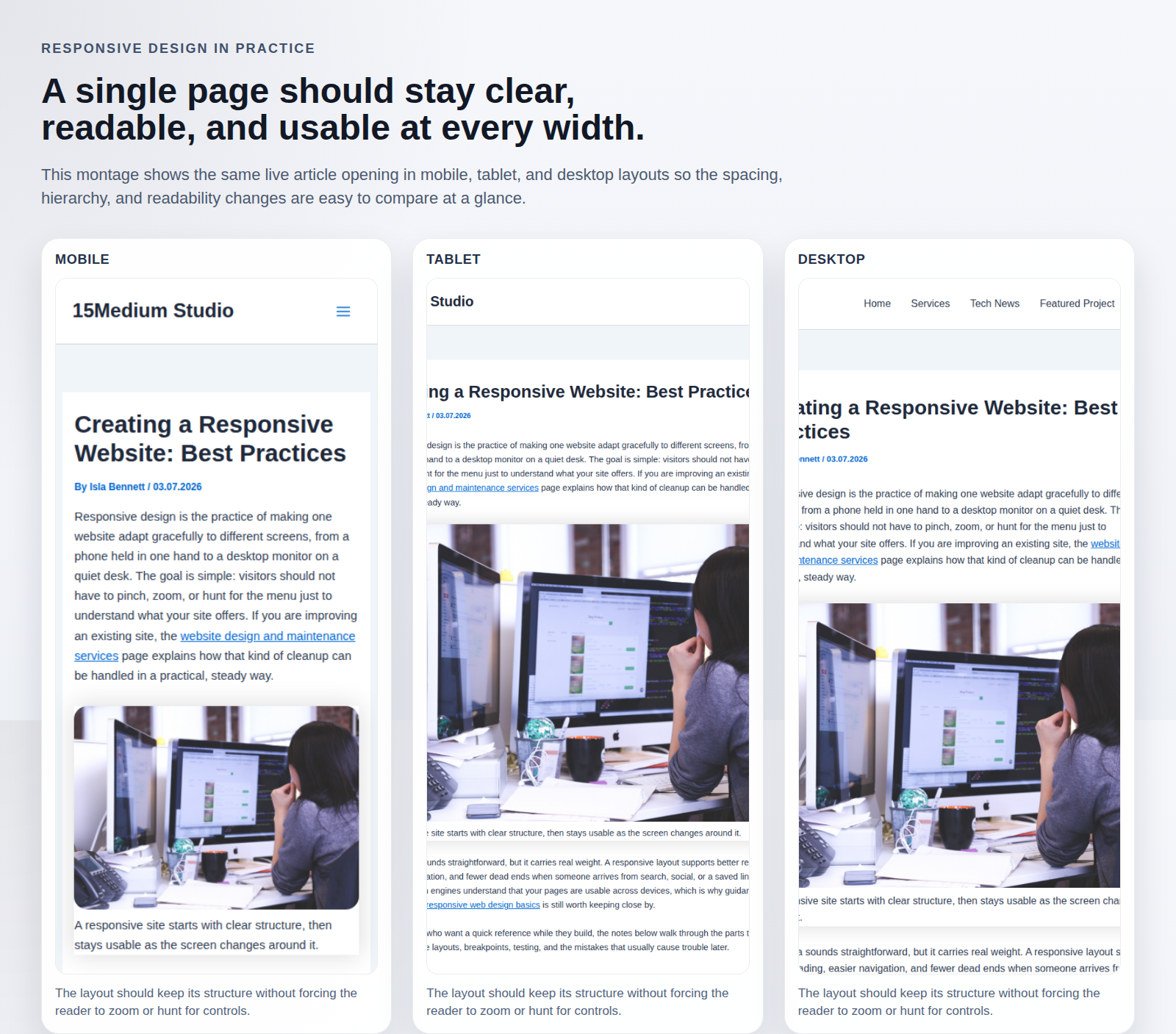
That idea sounds straightforward, but it carries real weight. A responsive layout supports better reading, easier navigation, and fewer dead ends when someone arrives from search, social, or a saved link. It also helps search engines understand that your pages are usable across devices, which is why guidance from web.dev on responsive web design basics is still worth keeping close by.
For readers who want a quick reference while they build, the notes below walk through the parts that matter most: flexible layouts, breakpoints, testing, and the mistakes that usually cause trouble later.
Importance of Responsive Design
Responsive design is not a decorative extra. It is the difference between a site that feels calm and one that feels like it is arguing with the device in front of it. A page that works on a desktop but breaks on mobile leaves people doing extra work, and visitors rarely reward extra work with patience.
The most useful definition is also the plainest one: the page changes shape to fit the available space without losing meaning. That includes text that remains readable, images that scale well, and navigation that still makes sense when the screen gets narrow. The MDN guide to responsive design is a solid companion if you want a more detailed technical overview.
- User experience: visitors can move through the site without fighting the layout.
- Accessibility: text, controls, and spacing are easier to use on touch devices and smaller screens.
- SEO support: mobile-friendly pages are easier for search systems to evaluate and serve.
- Maintenance: one flexible system is easier to keep healthy than separate versions for every screen size.
Key Principles of Responsive Design
The heart of responsive design is not a long list of device names. It is a set of habits that keep the layout flexible enough to handle change.
Fluid grids and flexible images
Use relative units when possible so columns and content can expand or contract smoothly. Instead of locking a layout to one fixed width, let the page breathe. Images should follow the same rule: they should scale down cleanly, and they should never spill outside the container that holds them.
Media queries and breakpoints
Media queries let you change the layout at the points where the design starts to strain. The trick is to choose breakpoints based on content, not on a random list of device sizes. If a headline wraps badly or a card row becomes cramped, that is your signal to adjust the design.
The MDN page on using media queries is a useful reference when you want to see how those changes are written in real CSS.
Mobile-first design
Starting with the smallest screen first is usually the safest path. It forces you to keep only the most important content and actions in view, then add complexity only where the screen has room for it. That approach often leads to cleaner navigation and faster decisions for visitors on the go.
Keep tap targets comfortable
On a phone, a link or button that looks fine on a desktop may suddenly feel tiny. Make sure controls are large enough, spaced well, and easy to tap without accidental clicks. The WCAG guidance on target size is a helpful checkpoint when you want to reduce friction on touch screens.
Tools for Testing Responsiveness
Designing for many screens is easier when you test early and often. A layout can look polished in a wide browser window and still fall apart on a smaller display, so it pays to check the page in more than one environment.
| Tool | Best for | What to watch |
|---|---|---|
| Chrome DevTools device toolbar | Fast checks while you build | Spacing, stacking, and whether navigation still fits |
| BrowserStack | Testing across real devices and browsers | How the site behaves outside your own laptop setup |
| Lighthouse | Performance and usability checks | Mobile performance, image weight, and page clarity |
When the site is also part of a broader workflow, such as a client portal or internal dashboard, a web app generator can help a team sketch the structure quickly before the responsive details are refined. It is not a substitute for design judgment, but it can shorten the time between a rough idea and something that is worth testing.
Testing works best when it becomes routine. Open the page, narrow the browser, rotate a tablet if you have one, and try the same task in each view. If the path to contact, read, or buy gets harder at any size, the design still needs attention.
Common Pitfalls to Avoid
Most responsive problems are not mysterious. They usually come from a few predictable habits that get overlooked when the desktop version looks good enough.
- Starting with the desktop and shrinking later: this often leaves mobile users with crowded content and awkward navigation.
- Fixing widths in pixels everywhere: rigid sizing can work against the natural flow of a responsive layout.
- Letting images stretch without limits: media should remain proportional and stay inside their containers.
- Ignoring performance: large files, heavy scripts, and cluttered layouts tend to hurt mobile users first.
- Making buttons too small: touch devices need comfortable spacing, not precision work.
It also helps to remember that responsive design is not only about screens. It is about context. Someone reading on a phone may be standing in line, someone on a tablet may be seated on a couch, and someone on a desktop may be trying to compare details carefully. The layout should respect all three.
Conclusion
A good responsive website does not feel clever. It feels settled. The content is easy to read, the navigation is easy to use, and the layout adapts without drawing attention to itself. That quiet reliability is usually the sign that the work underneath it has been done well.
If you are improving a site now, start with the essentials: flexible structure, sensible breakpoints, touch-friendly controls, and repeated testing on more than one screen. If you want more practical site guides, you can browse the blog for related articles and revisit the services page when you are ready to plan the next step.