What are calls to action (CTAs)?
A call to action (CTA) is the moment on your website that tells a visitor what to do next-usually with a clear label and a supporting reason. It can be a button, a link, a form field, or even a short line of text that nudges someone from “browsing” to “taking action.”
Think of it like the final sentence on a sign at the top of a staircase: now that you’re here, do the next right thing.
Why CTAs matter in web design
Even a beautiful website can feel like a maze if visitors don’t know where to go. Strong CTAs help in three practical ways:
- They reduce decision fatigue. When choices are unclear, people bounce. A good CTA is a shortcut through the mental fog.
- They connect page intent to visitor goals. The headline explains what you do; the CTA tells them what the page is for (request a quote, book a consult, download a checklist, etc.).
- They improve measurable outcomes. CTAs often sit right where conversion happens-newsletter signups, contact submissions, service inquiries, and more.
Best practices for creating effective CTAs
1) Match the CTA to the visitor’s stage
Not every visitor is ready to contact you. Use CTAs that fit where they are in the journey:
- Awareness: “Learn how we approach restorations” (blog post, guide, or FAQ)
- Consideration: “See service options” (pricing page, package overview)
- Decision: “Get a quote” or “Contact us” (short form or direct message)
2) Use specific, benefit-led wording
Swap vague labels like Submit or Click here for language that names the payoff:
- Instead of “Submit”: “Request a website fix”
- Instead of “Learn more”: “Check maintenance plans”
- Instead of “Download”: “Get the CTA checklist (PDF)”
If you can’t explain the benefit in a few words, the CTA is probably trying to do too much.
3) Make the CTA visually unmistakable
A CTA should stand out without screaming. Practical ways to do that:
- Use a contrasting button color (but keep it consistent site-wide).
- Place CTAs where the reader expects the next step (often after a short value block).
- Give it breathing room: padding, whitespace, and readable font size.
Also: don’t hide the CTA behind tiny text or a link disguised as another paragraph.
4) Reduce friction right at the point of action
The CTA shouldn’t force a visitor into hoops. If the next step is a form, consider:
- Fewer fields for early-stage actions.
- Clear expectations (“We reply within 1 business day.”)
- Inline help text to prevent errors (“Include your website URL.”)
Friction is the CTA’s silent enemy. Every extra question competes with momentum.
5) Reinforce with supporting microcopy
Buttons are short. The surrounding sentence can do the work. Use microcopy to reassure:
- What happens next
- How long it takes
- What the visitor will receive
- Why it’s safe/low-risk
Example pattern:
Button: “Request a Website Checkup”
Microcopy: “Tell us what’s broken-get a clear fix plan within 24 hours.”
6) Test one variable at a time
CTAs are small, but they behave like big levers. If you run A/B tests, try changing just one thing per round:
- Button text first (clarity)
- Then button placement (visibility)
- Then form length (friction)
This keeps you from guessing which change helped-and makes future improvements easier.
Examples of effective CTAs (and why they work)
Here are a few CTA examples you can adapt. Notice the pattern: clear action + clear audience benefit.
Example 1: Service page CTA
Button: “Get a quote for website maintenance”
Supporting line: “Fast turnaround, clear scope, and ongoing support.”
Why it works: It matches the service page intent and gives visitors a reason to act now.
Example 2: Blog post CTA
Button: “Use our maintenance checklist”
Supporting line: “A quick way to spot issues before they become emergencies.”
Why it works: Blog readers are often in awareness mode. A checklist feels like the “next right step.”
Example 3: Homepage CTA
Button: “Are you ready for a website fix?”
Supporting line: “Describe the problem-get a straightforward plan.”
Why it works: It’s emotionally aligned (people come because something feels wrong) and it sets an expectation.
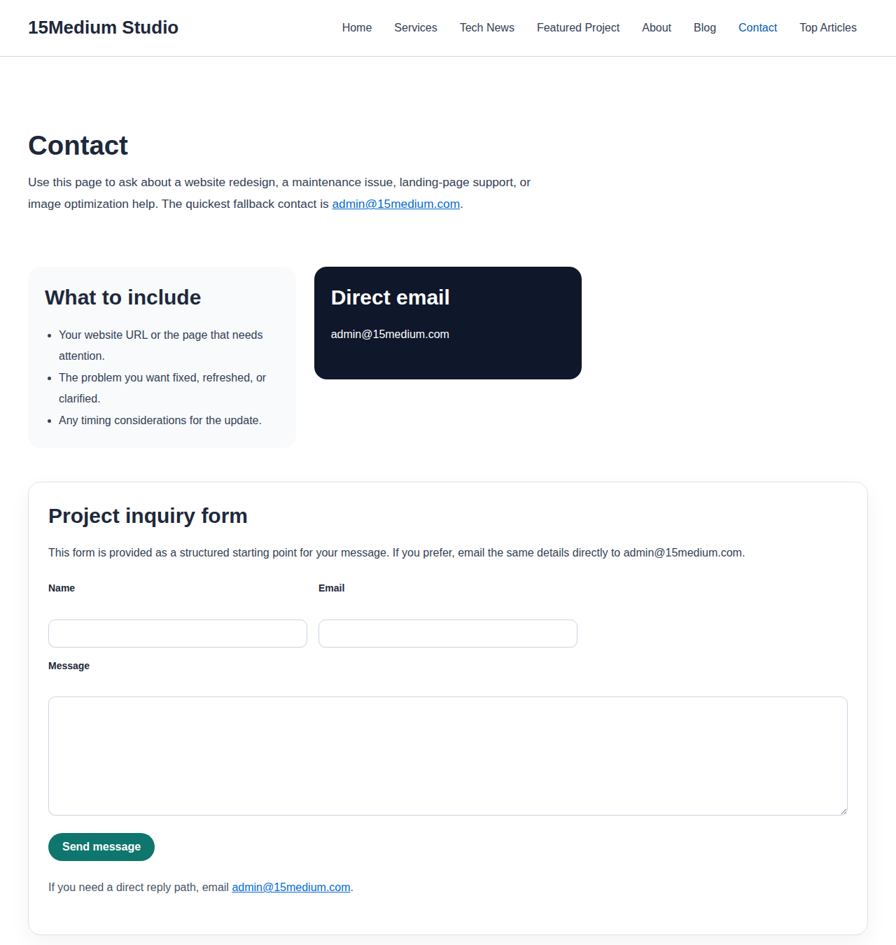
Example 4: Contact page CTA
Button: “Send my website request”
Supporting line: “We’ll reply with next steps.”
Why it works: It reduces uncertainty. Visitors know what “send” means.
Quick CTA checklist before you publish
- One CTA per section (don’t let multiple buttons compete).
- CTA wording states the outcome, not just the action.
- CTA sits near relevant proof (benefits, bullets, testimonials, FAQs).
- Form friction is minimized for early-stage actions.
- Microcopy answers “what happens next?”
Conclusion
Effective CTAs don’t trick people-they guide them. When your CTA matches visitor intent, uses benefit-led language, and removes friction, your website stops being a brochure and starts being a conversation that leads somewhere.
If you want to improve results across your site, start small: pick one page, upgrade its CTA, and measure what changes over the next couple of weeks. That boring little experiment beats “redesigning everything” every time.
Next step: Browse more practical guidance in our services section or explore related articles in the blog.