The contact page is where a website stops being a brochure and starts answering questions. If it is good, people move forward without thinking about it. If it is bad, they think about it a lot, which is never a compliment.
By Theo Marlowe | Updated July 12, 2026
When I look at a contact page, I usually ask four things: Can I reach a human fast? Do I know what happens after I click submit? Does this page feel safe and straightforward on my phone? And does the business look organized enough that I want to write to it? Steve Krug’s advice from the usability world still holds: “Don’t make me think.”
That sounds simple until you watch a page turn a basic question into a scavenger hunt. The W3C WAI forms guidance, the MDN form reference, and Nielsen Norman Group’s advice on form labels and placeholders all point to the same lesson: forms work when the structure is obvious, the fields are predictable, and the user never has to guess what comes next. That is not glamour. It is conversion hygiene, which is the less exciting but more useful cousin.
In this guide, I will walk through why the contact page matters, what to include, how to design it for real people, and what strong examples have in common. I will also show the workflow layer behind the page, because a contact form is only half the job; the other half is what happens after someone presses the button.
Why a contact page matters
I treat the contact page as a business test. If the site cannot answer a basic request gracefully, it will struggle with everything else that depends on trust. That includes sales, support, collaboration, media inquiries, and the general question of whether anyone is home.
A contact page matters for three practical reasons. First, it reduces friction. A visitor should not have to solve a mystery to ask for help. Second, it builds credibility. A page with clear contact options signals that the business expects to hear from real people and is prepared to respond. Third, it filters and routes inquiries. Not every message should go to the same inbox, and not every visitor is trying to do the same thing.
That routing piece is underrated. A contact page is often the first place where a website turns into an operating system. A simple message form can become a lead source, a support queue, a booking entry point, a partner request channel, or all four if the page was assembled with optimism instead of structure. Optimism is a lovely personality trait. It is a poor information architecture strategy.
If you want a useful rule, use this one: the more expensive the next step, the clearer the contact page should be. A visitor who is about to request a quote, ask for support, or discuss a project is already doing work. The page should reward that effort, not add another obstacle.
Key terms and definitions
Before I get into layout and copy, I want to define the terms I use when I review a contact page. These are the small levers that decide whether the page feels calm or clumsy.
| Term | What it means | Why it matters on a contact page |
|---|---|---|
| CTA | Call to action. The button or prompt that tells the visitor what happens next. | A weak CTA makes the page feel uncertain. A clear CTA makes the next step obvious. |
| Validation | The feedback a form gives when a field is missing or incorrect. | Good validation prevents silent failure and saves people from resubmitting the same form three times. |
| Microcopy | Small bits of helper text near a field, button, or instruction. | Microcopy can answer the question the user was about to ask, which is why it saves everyone time. |
| Routing | How a submission gets sent to the right person, inbox, or workflow. | If routing is vague, messages get delayed, duplicated, or ignored. This is not a feature. |
| Friction | Any step that slows or confuses the visitor. | Every extra field, unclear label, or strange requirement adds friction. Contact pages should remove it. |
| Conversion | The moment a visitor completes the action you want, such as sending a message or booking a call. | A contact page is not just a utility page. It is often a conversion page in disguise. |
Essential elements to include
I like to think of a contact page as a small negotiation. The visitor asks for a path, and the site answers with a clean one. That only works if the essentials are actually present. Here is the minimum set I would expect on a serious page.
1. A simple form with predictable fields
The form should usually start with the basics: Name, Email, and Message. That is not because those are magical fields. It is because they are usually enough to begin a real conversation. Ask for more only when the extra information genuinely improves the follow-up.
If you need to qualify leads, consider a small set of optional fields such as project type, budget range, or timeline. Do not turn the form into a tax filing system. Visitors can sense when a form was designed by someone who enjoys collecting information more than serving people.
2. A clear call to action
The button should say what happens next. Send Message, Request a Quote, Book a Call, or Ask a Question all work better than vague language. A CTA should reduce anxiety, not create a tiny cliffhanger.
If the page supports more than one outcome, make the options explicit. For example, one section might invite general questions, another might steer visitors to service details on the services page, and another might point people to the about us page for more context about the team behind the site.
3. Contact details that do not hide
Include a visible email address, a phone number if one is published, and a business location or service area when it is relevant. The point is not to crowd the page with redundant information. The point is to prove that the business can be reached in more than one way.
I also like to include a short note about response time. Something as plain as We usually reply within one business day gives visitors a much better sense of what to expect than silence does. Silence is not a brand asset.
4. Alternate paths for different needs
Not every visitor wants the same thing. Some want support. Some want sales. Some want a press contact. Some want to know whether the place still exists. A useful contact page gives those people different doors instead of making everyone line up at one tiny gate.
Common alternate paths include:
- Support or help desk link
- Sales or project inquiry form
- Media or press contact
- Billing or account support
- Social media profiles when they are truly active
5. A privacy or reassurance note
Contact pages often ask for personal information, so a short reassurance note helps. It can be as direct as: We only use your details to respond to your message. If the page collects more sensitive data, be clearer. Visitors are right to be cautious, and your job is to make caution unnecessary.
6. A helpful confirmation step
Once the form is submitted, show a confirmation message that tells the visitor what happens next. Give them a time frame, a backup path, or a reference number if it helps. A polite thank-you is nice. A useful confirmation is better.
| Element | Why it belongs | What to avoid |
|---|---|---|
| Name, email, message | They support a real conversation without overcomplicating the first contact. | Long forms, hidden required fields, and anything that feels like a job application. |
| CTA button | It makes the outcome obvious. | Generic button labels and vague instructions. |
| Public contact info | It creates trust and gives people a fallback. | Hiding every human path behind a form with no backup. |
| Response-time note | It sets expectations before frustration starts. | Making people guess when anyone will answer. |
| Confirmation message | It closes the loop and reduces repeat submissions. | A dead-end thank-you page with no context. |
Design tips for usability
Design is not decoration here. The contact page should feel like a clean instrument panel, not a museum label. The goal is to help people finish a task quickly and confidently.
Keep the layout simple
A contact page works best when the structure is obvious at a glance. I like one strong headline, one short explanatory paragraph, the form, and then a small support area for alternate contact methods. That is usually enough. If the page starts competing with itself, the visitor loses.
Whitespace matters because it reduces visual arguments. The page should make the form the hero, not the supporting actor trapped behind five sidebars and an inspirational quote nobody asked for.
Design for mobile first
This is the part people say they have already handled, right up until they test the page on a phone. On mobile, the form should stack cleanly, the labels should stay visible, and the button should be easy to tap without precision surgery.
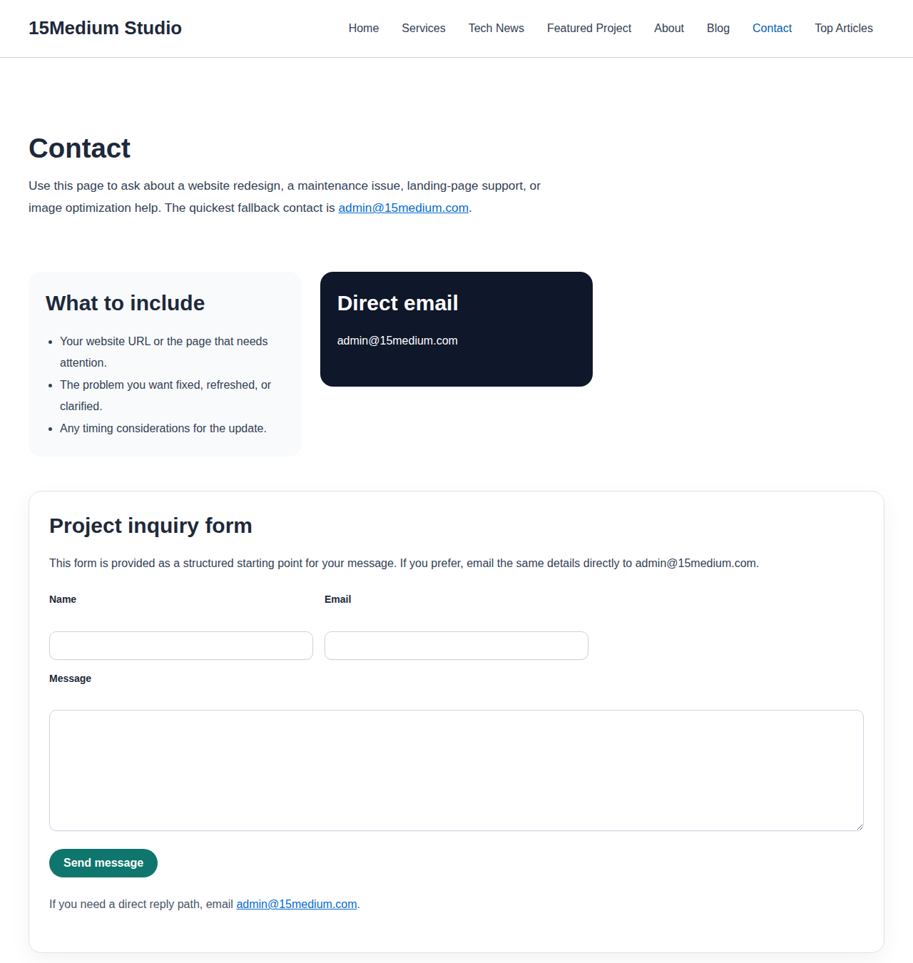
That image is not there to be decorative. It is there to remind me that a page is only as good as its smallest screen. The desktop version can look polished and still fail the moment the viewport gets narrow.
Use visible labels, not cute guessing games
Field labels should be visible at all times. Placeholder text alone is fragile because it disappears exactly when the visitor needs it most. That is a cruel design choice dressed up as minimalism.
Clear labels, short helper text, and sensible error messages are better. They lower the cognitive load and reduce the feeling that the user is being tested by a form that forgot who is helping whom.
Show errors where the problem happened
If a field is wrong, say so immediately and show the correction near the field. The user should not have to hunt for the issue after the page reloads. That is the digital equivalent of handing someone a locked box and pointing to the hallway.
A good error message does three things:
- Names the field that needs attention
- Explains the issue in plain language
- Tells the visitor how to fix it
Keep visual hierarchy honest
The most important action should be the most visually obvious action. If the page has multiple buttons, the primary one should stand out without becoming a carnival sign. Secondary paths can be smaller and quieter. The point is to guide, not to shout.
I also prefer one clear dominant section over several equal-weight blocks. Equal weight is nice in philosophy. It is less useful in interface design.
Make accessibility part of the layout, not a patch later
Accessible forms are easier for everyone. Use proper labels, sufficient contrast, keyboard-friendly focus states, and helpful text for screen readers where needed. The W3C forms tutorial is useful here because it reminds designers that good form structure and accessibility are not separate projects. They are the same project with different nouns.
Give the page a calm tone
Contact pages often get written like marketing brochures trying to be friendly. That can work, but only if the friendliness stays useful. I would rather see a calm, direct voice than a page that sounds as if it was coached by a cheerful robot in a conference room.
Good tone on a contact page sounds like this: Here is how to reach us, here is what happens next, and here is the fastest path if your question is urgent. That sentence does more work than a paragraph of vague warmth.
Examples of great contact pages
The best contact pages are rarely the most elaborate ones. They usually win by being decisive. They tell the visitor where to go, what to expect, and how long the process will take. Here are a few public examples worth studying.
| Example | What it does well | What to borrow |
|---|---|---|
| GOV.UK contact page | It is direct, plainspoken, and built around the visitor’s next decision. | Minimal noise, clear routing, and language that respects the user’s time. |
| Apple contact page | It makes support paths easy to find without making the page feel crowded. | Strong hierarchy and a clean handoff from inquiry to the right help path. |
| Shopify contact page | It separates user needs instead of assuming one form fits every situation. | Segmenting by intent and making the first choice simpler than the last one. |
When I study those examples, I do not copy the visuals line for line. I copy the logic. The page answers the user’s question quickly, and the interface does not make a show of trying to be clever. Clever is overrated when the job is to reduce friction.
The common pattern is easy to miss because it is quiet: the best pages are organized around the visitor’s intent, not the business’s internal org chart. That is why they feel so easy to use. They reflect the actual problem at hand.
The workflow after submit
A contact page is only half a system. The other half is the workflow behind it. If the form sends messages into a general inbox with no owner, no subject line discipline, and no response target, the page may look functional while the business slowly absorbs the consequences.
So I always ask a boring but necessary question: Who owns the submission after it lands? If the answer is “everyone,” then the answer is effectively “no one.”
At minimum, the workflow should define:
- Where submissions go
- Who responds first
- How urgent messages get flagged
- What counts as a complete response
- How long the response target is
If the page begins handling lead qualification, support triage, or booking requests at scale, the workflow can become more structured. In that case, a third-party resource on AI consulting services can help figure out where AI fits before a messy inbox gets mistaken for a strategy. That is the useful version of automation: start with the process, then decide what deserves assistance.
Even without automation, the simplest improvement is often the most valuable one: make the page tell the visitor what happens next. A contact form that leaves people in suspense is a tiny trust leak. Enough of those, and the whole site starts to feel less dependable than it should.
Conclusion
A contact page does not need to be dramatic. It needs to be clear, usable, and trustworthy. If it answers the visitor’s question quickly, shows the right contact options, and routes the message to the right place, it has already done something important for the business.
If I were auditing a page today, I would check five things first: the form fields, the CTA, the mobile layout, the response expectation, and the post-submit workflow. If those are solid, the page usually stops being a problem and starts being a bridge.
Before you move on, evaluate your own contact page against this checklist:
- Does the form ask only for what is genuinely needed?
- Is the CTA specific and easy to understand?
- Are email, phone, or support paths visible without hunting?
- Does the page work cleanly on mobile?
- Are errors, confirmations, and response times explained plainly?
- Does the follow-up workflow have an owner?
If the answer to any of those is “not quite,” that is your next build task. Start there. A better contact page is usually not a redesign problem; it is a clarity problem. Those are easier to fix, which is fortunate, because the internet already has enough beautiful dead ends.